Changing, Copying and Creating Themes
In order to change themes, simply select a different theme.cssfile from the Files tab. If you want to copy or create a new theme, simply copy and paste one of the existing theme directories and change the css file and graphical assets as required and then link to the theme.css file in this directory from the Files tab.
 You can use the Theme Visualiser template to visualise and change themes. You may also find the following project export useful. It contains most of the commonly used features in WebMaker, together with their styling information. You can use this project to further test the results of your SASS/CSS changes.
Theme Design Template
You can use the Theme Visualiser template to visualise and change themes. You may also find the following project export useful. It contains most of the commonly used features in WebMaker, together with their styling information. You can use this project to further test the results of your SASS/CSS changes.
Theme Design Template
Using SASS
From WebMaker 9, SASS is used to define WebMaker Themes, and the Theme Visualiser Template is included with the distribution. The fastest and easiest approach for changing and creating new themes is to edit the .sass files and use a suitable SASS compiler to produce the .css files. The results can be viewed by creating a project based on the Theme Visualiser Template and then selecting the compiled CSS files from within the Files tab in the Page Designer.
WebMaker Themes now use a set of SASS variables, the values of which are inherited by all primary elements of WebMaker applications. These variables are located at the top of the .sass files and can be modified to easily create new themes and modify existing ones.
Themes Directory Structure
WebMaker 8 made it easier to create and manage new themes. All CSS information for the core web application is now contained within a single file called theme.css. Each theme will have a
theme.cssfile by default. Within the application's
...\webappdirectory there will be a collection of theme directories. Each of these directories contain all the styling and graphical assets required by a particular theme. Some themes may have additional theme css files within the
csssub-directory for theme-specific aspects.
Control Structure
WebMaker version 8.0 introduced a more consistent class-based approach to styling your web applications. Wherever possible, each control is identified by a unique CSS class name. In WebMaker, the HTML markup for a control may change depending on the placement of controls within different containers. This class-based approach enables controls to be identified more easily and consistently.
Generally, all styling rules are contained within the top-level class that identifies the control. This reduces the risk of "contaminating" other controls when adjustments are made to specific controls.
WebMaker controls are now "richer" by default. Each control is made up of multiple layers of HTML markup, with the class names identifying the relevant parts of each control.
Some of the important layers are detailed below:
{control_name}Control Class - Where control_name is the name of your control, textboxControl for example.
controlBody Class - Each control contains a controlBody class that is used for different purposes depending on the type of control. For example, in some instances it might be used for introducing padding and in other instances it might be used to position other control elements within the internal space of the control container.
Within the controlBody, there may be a range of classes depending on the usage scenario and type of control being used. There are some common classes that apply for most controls and these important classes are discussed in more detail below:
Main Control Classes
isMandatory, mandatory
Mandatory controls will contain the isMandatory class. In addition, a separate mandatory class will be present for the part of the HTML markup that manages the display attributes of the mandatory marker.
isDisabled
Disabled controls are indicated by the presence of the isDisabled class. This class is also present for the labelControl, to provide a disabled "look-and-feel" for the control and its associated label.
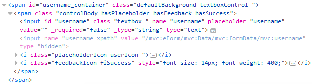
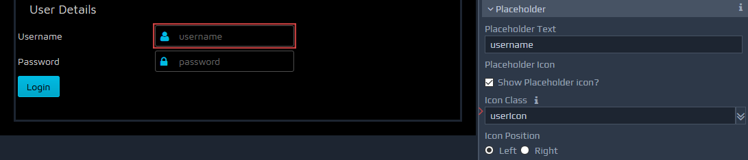
hasPlaceholder, placeholderIcon, placeholderRight
WebMaker 8.0 also introduced the concept of placeholder icons. This provides the ability to place an image to the left or right hand side of controls. You simply have to tick to indicate that a placeholder is required and then indicate whether you want the placeholder icon on the left or right hand side of the control.
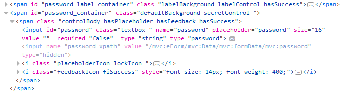 If a placeholder icon is required then a class of hasPlaceholder will appear within the control. In addition, a placeholderIcon class will be added to provide the main styling information for the selected placeholder. The placeholderIcon class is then supplemented by specific placeholder classes to enable you to choose an icon of your choice.
A predefined list of icons is provided, which include the following:
.defaultIcon
.validateIcon
.searchIcon
.dialogIcon
.dateIcon
.lockIcon
.userIcon
.emailIcon
.phoneIcon
.addressIcon
See below for details on how to extend this list of icons.
By default, the placeholder icon is placed on the left, but you can also choose to place this on the right. If the icon appears on the right then an additional class placeholderRight will be present within the control markup.
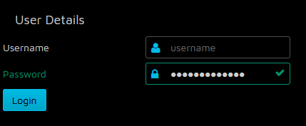
hasFeedback, FeedbackIcon
WebMaker controls now indicate the outcome of certain operations via a feedback mechanism. For example, server errors and validation errors raise CSS classes hasError and hasSuccess depending on the outcome. These classes are supplemented by 'feeback icon' classes fiError and fiSuccess that provide styling information for the appropriate icons or other attributes to visually portray the outcome of certain operations.
Font Icons
Within each "theme" css directory you can find a
theme_icons.cssfile, which contains a very extensive set of font based icon classes. If the css file is added to the Application, then any of the defined classes can be used for placeholders and other uses. All the classes are prefixed as icon-... e.g. icon-lock-open. There are over 250+ classes that can be used in addition to the standard classes that may be defined in the selected theme files.
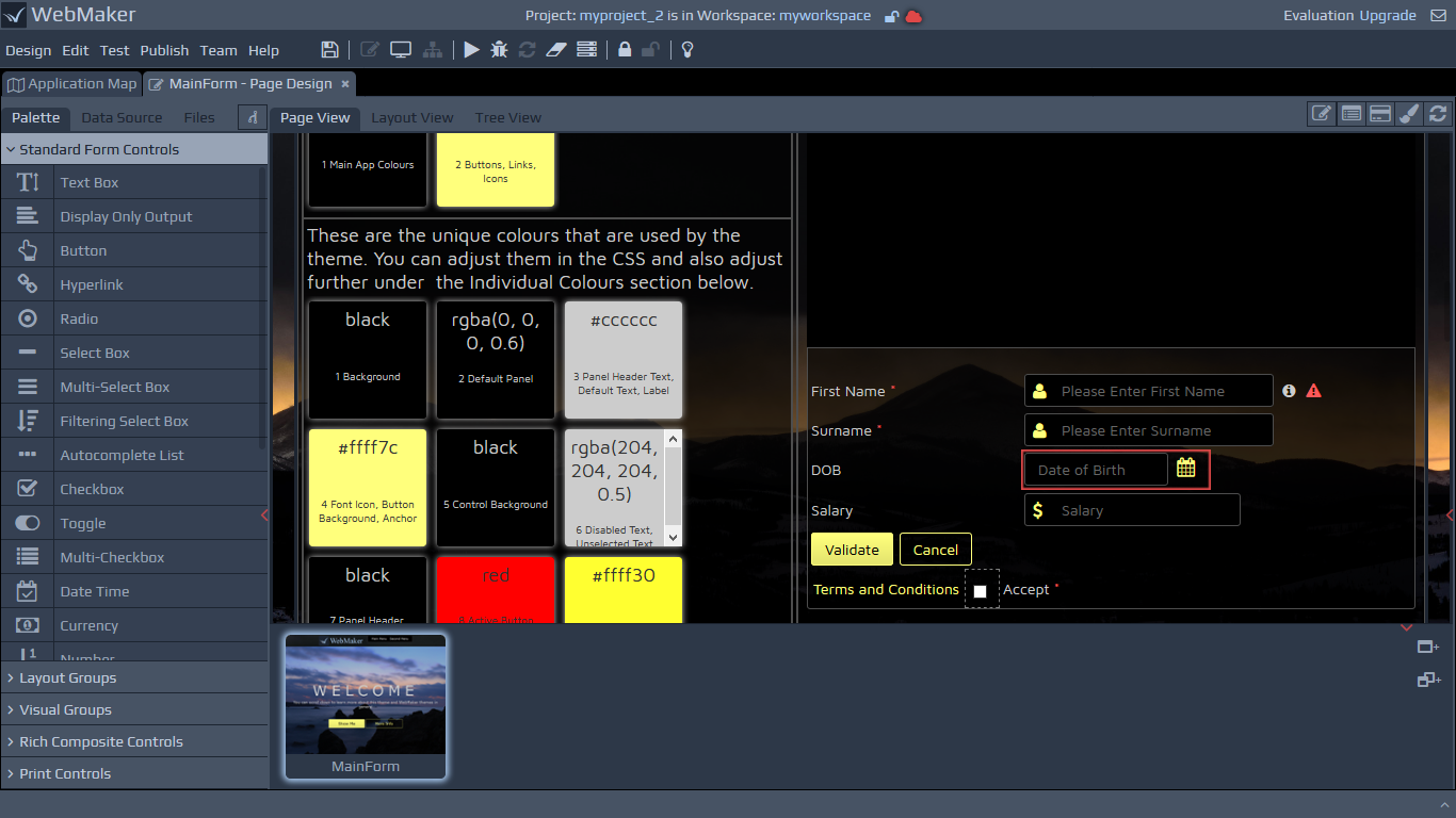
Theme Examples
A number of themes are shipped with WebMaker, with some using different approaches for handling the look-and-feel, as well as the HCI aspects of resulting applications
For example, the transitionstheme does not present hasSuccess styling as they are not defined within the CSS. If a field is defined as mandatory the isMandatory class places a grey triangle over the control rather than a default '*' to the right of the control label. The hasError is rendered with a red triangle over the corner of the control. Most of the other themes display both errors and successfully validated input fields with the display of a cross or tick respectively. You search for the .hasSuccess and .fiSuccess css selectors in the theme SASS/CSS files to gain a better understanding of how this is achieved.
Reduced Images - font glyphs
The new themes in WebMaker reduce the need for image files to enable easier management and production of new themes. This means you will only have to change a single theme.cssfile in many cases to create very different themes.
Below is a list of the main top-level control classes in WebMaker. Some composite controls are composed from a collection of primitives and may not have a containing class:
.labelControl
.textboxControl
.outputControl
.buttonControl
.enhancedButtonControl
.hyperlinkControl
.radioControl
.selectControl
.multiSelectControl
.filteringSelectControl
.autocompleteControl
.checkboxControl
.switchControl
.multiCheckboxControl
.dateControl
.splitDateControl
.currencyControl
.numberControl
.spinnerControl
.textareaControl
.richTextEditorControl
.paragraph
.secretControl
.imageControl
.customControl
.borderedGroup
.fieldsetGroup
.tabContainer
.collapsibleSection
.dijitDialog
.divider
.separator
.accordionContainer
.basicTableContainer
.editableTableContainer
.pagingTableContainer
.dataCard
.chartGroup
.mapCanvas
.numberSliderControl
.treeControl
.listBuilderControl
Locating controls based on theme attributes
If you review the theme.sass or theme.cssfile for one of the predefined WebMaker themes, you should notice the styling rules are arranged around theme attributes. This should enable you to make changes to theme elements such as colours, fonts group heading, etc. in a few locations and have them applied across your application automatically. For example, you will see rules organised under headings such as Group Headings, Labels, Controls, Borders and Margins, etc. If you wish to deal with a single control then you should be able to search for the CSS class that is the primary class for that control and see all the styling rules that apply to this class. For example, if you want to make changes to the textboxControl then search for ".textboxControl" and make changes to the resulting classes. Many of the controls will re-use the same attribute settings, so be mindful when making changes for one type of control. You can learn more about these controls within the Design Palette section.
Additional Notes - Third Party Controls
WebMaker utilises some third party controls in certain scenarios. Examples of this include the Dojo Currency, Number and Number Spinner controls. As a result, you may notice certain "structural classes" with !important against them. These are present to reset or block certain dojo styles that might "leak" through, but may not appear to provide any useful styling functionality in the theme itself.
You should also notice the sparing use of the !important attribute to prevent multiple overrides, reducing complexity. You should also notice sparing use of styling classes against HTML elements to reduce the unintended cascading and "leaking" of some of the styling information. Usual cascading is restricted wherever possible within the general classes that might apply to multiple controls.
Sometimes you may not observe any changes on the control when certain styles are applied. This is usually be due to the fact that certain style information in the underlying CSS files is overriding the in-line style being applied by the selected option on the Control Styling palette. In these scenarios you will have to track the CSS rules that are being applied and overridden and change your style combinations accordingly. Browser Developer Tools can assist with introspection in such scenarios.